A portfolio of maps analyzing geographic variation in health care, including utilization and costs, access, and assessments of disparities in care. In addition, I have conducted numerous health impact evaluations on transportation planning and development projects.
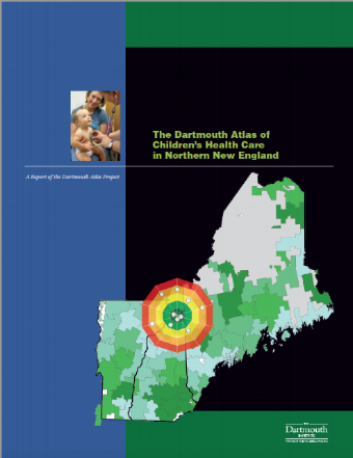
Figure 1. Dartmouth Atlas of Children's Health Care in Northern New England. Published December 2013.
Figure 2. Distribution of tympanostomy tube (ear tube) placement in Vermont, New Hampshire and Maine. Published as part of the Dartmouth Atlas of Children's Health Care in 2013.
Figures 1 and 2. The rate of ear tube placement varied more than four-fold across the 30 pediatric surgical areas, from fewer than 4 per 1,000 in Bangor, Maine (3.4), Presque Isle, Maine (3.7), and Ellsworth, Maine (3.9) to more than 12 per 1,000 in Middlebury, Vermont (15.2) and Berlin, New Hampshire (13.1).
Figure 3. Distribution of % Black, % below poverty, access to fast food, and population density across census block groups.
Figure 3. Generally, higher percent Black, by census block groups, are located in the southeast and higher poverty concentrations are seen in the southeast and southwestern states. Fast food access is highest on the coasts, which are the areas where population density is highest in the US.
Figure 4. Rate of urgent care center utilization for non-urgent conditions was consistently higher in hospital referral regions in the eastern United States.
Figure 5. Those areas with higher urgent care center utilization tended to have a higher ratio of urgent care center to emergency department utilization for non-urgent conditions.
Figures 4 and 5. There was considerable regional variation in the rate of urgent care center, emergency department, and physician office utilization for non-urgent conditions. Rate of urgent care center utilization ranged from 2.6 to 11.5 visits per 100 beneficiaries. Areas of higher emergency department utilization tended to correspond to areas of lower urgent care center and physician office utilization.
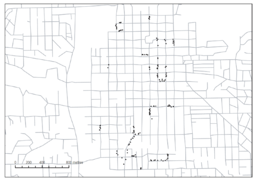
Figure 6. A dot map of geocoded addresses in Iowa City, IA.
Figure 6. Geocoded dot map made with public-sector street network databases, such as the TIGER files created to support US Census data collection activities.
Figure 7. Map depicting the concentration of built areas, population density and main transportation corridors.
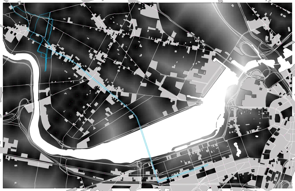
Figure 8. Map illustrating a high traffic bike route from Boston to Cambridge, MA.
The Metropolitan Area Planning Council (MAPC), Boston's regional planning agency, uses maps to quantify the effects of measures of the built environment, such as sprawl, land-use mix, residential density and street connectivity, on physical activity, body mass index, cancer, cardiovascular disease, type 2 diabetes and mortality.


